Adapt to survive - part 10

Two years on from dipping my toes in the waters of comic strips a sea-change was occurring in the world of commercial art. Illustrators and designers were wholeheartedly embracing the new world of computer graphics. Computer graphics had been around since the 1980s, but the Quantel paintbox at 30K was beyond the reach of the average illustrator and it was really the advent of the Power Mac in the mid ‘90s that offered artists the ability to engage with the beast in a box.

Mind you in 1996, it was still a fairly daunting outlay and to set up a computer with all the peripherals required would set you back about 12-15K. And then once you had the thing set up with (in my case) a 750Mb hard-drive and a generous 32Mb of RAM (just sufficient for an image in Photoshop to slowly tile down every time you saved it), you had to struggle to learn the software and the software for all the other bits and bobs that you needed. A few artists worked with vector software (such as Illustrator or the excellent Freehand) which could manage quite nicely with next to no RAM, but the learning curve was steeper and so artists gravitated towards Photoshop which was a real RAM guzzler at a time when you wouldn’t see much change out of a grand if you wanted to purchase 64Mb of the stuff.

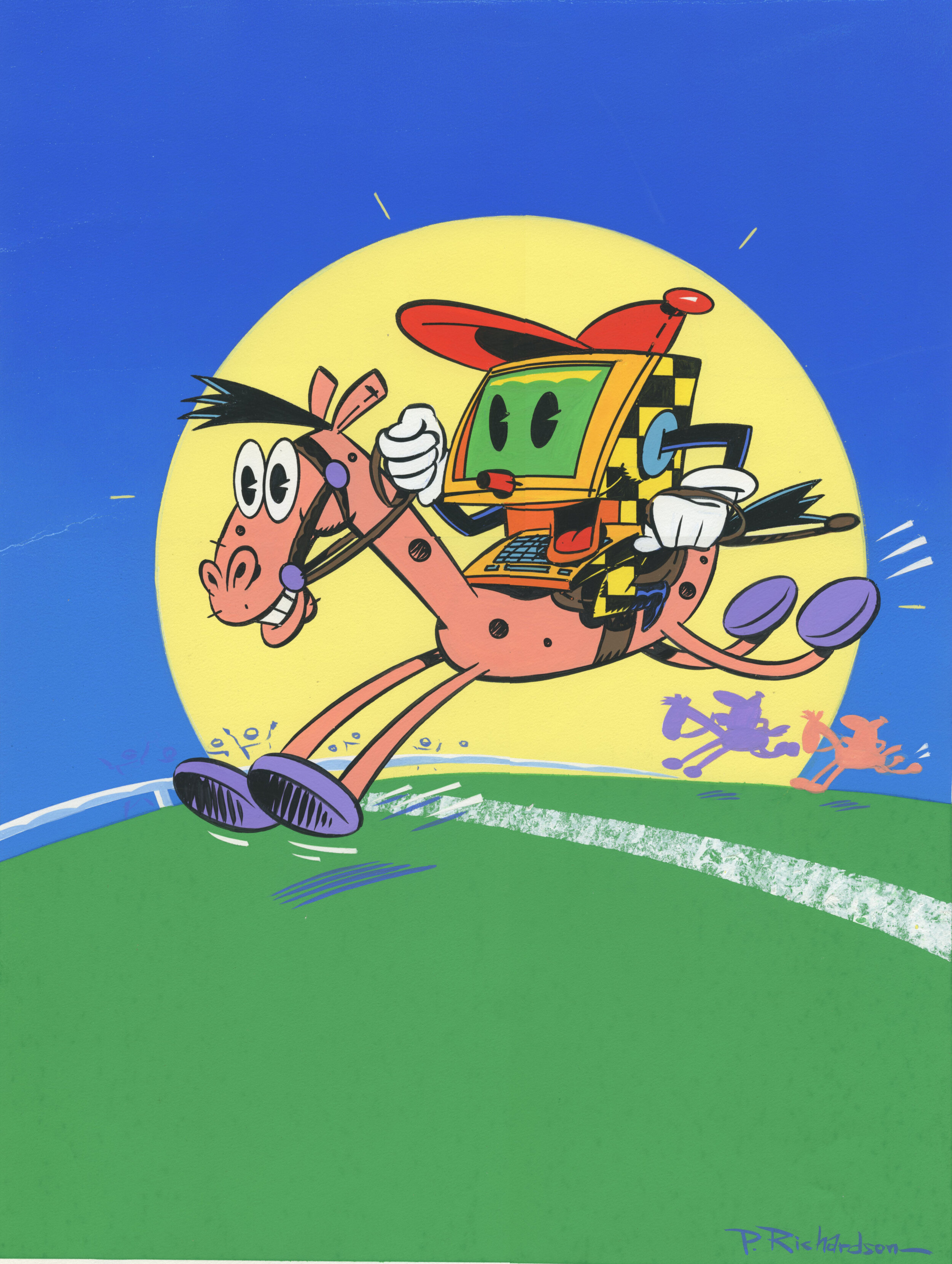
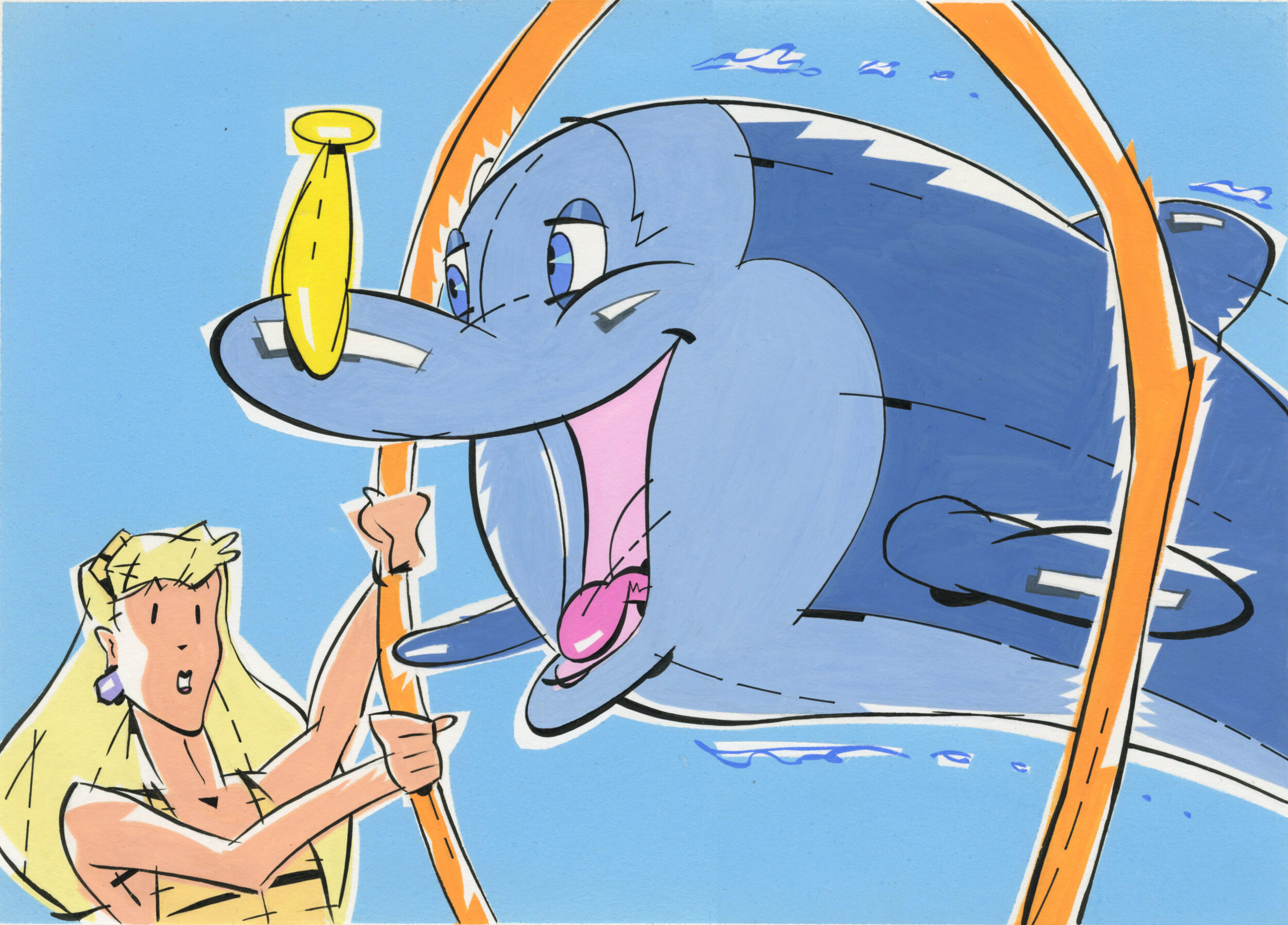
But, once I was up and running, I realised that the world was changing and I had made the move at the right time—jobs came in on the strength of my having the necessary kit to deliver what clients now wanted. The only downside was, that in the rush of excitement, we were succumbing to a welter of horrible computerised bells and whistles that look horribly dated now.

To put it in a nutshell, we were so seduced by the superficial gloss and sheen of computerised art that we were screaming from the rooftops, “Hey Look! I drew this on a computer!”. The ghastly deadliness of the finished result was lost upon us. There were one or two illustrators who lost their marbles and went overboard to such an extent that they ruined their sense of aesthetics in the process.

Here’s some examples of the stuff I was churning out in those early days of computerised illustration.

Illustration from a story called ‘Rainmaker’ every bell and whistle, including daft stuff likes lens flare has been added—”Gee Mom, I gotta computer!”

Everything had to shine! A series of funny animals for some kind of lucky drink.

I managed to secure a fortnightly slot for a artwork called Wally’s World, it was a bit like Look and Learn insofar as you were drawing tales from World History—again the computer and Photoshop greatly speeded up the process.

Adapt to survive - part 9

The inevitable happened—my agent went bust—owing his artists a small fortune—anything from 20k to 50k and this was back in 1991—so we are talking a lot of money. We tried to set up our own agency but, in the meantime, there was the urgent need to generate income.
With my A3 samples stuffed in my A3 folio I took the train to London and paid a visit to King’s Reach Tower, where on the 14th floor dwelt the creative team responsible for 2000AD. When I arrived in their offices I was told that they were not commissioning work for 2000AD, one of the team directed my gaze towards a plan chest stuffed with artwork. Apparently the recently departed editor of 2000AD had farmed out enough work to friends and family to fill the pages of the UK’s greatest science fiction comic for the next five years. So, 2000AD was a closed shop—but, there was a new project that they wanted to discuss with me.
They were in the throes of launching a new comic based around SEGA’s little blue hedgehog. Sonic the Comic would carry the adventures of the adrenalised spiky little fella along with action-packed strips based on other popular computer games. My strip was to be based on a crime fighting team game called Streets of Rage.
I was given a script and told to go away and turn it into five pages of full-colour comic. More scripts would follow which would comprise a 30 page story full of fists, explosions, bullets and bombs.
My samples had been rendered in black and white—I needed to evolve a way of creating colour comics speedily. I tried various heavy duty water colour papers and eventually settled on Fabriano paper. It had the advantage of absorbing magic markers (I didn’t have the necessary skill set or time to work with water colours) without the colours spreading beyond the confines of the black ink key lines.
The work was not wildly generously rewarded but Boy was it fun. At a pinch I could manage five pages a week, although in some cases such as the sample with the crowd scene a week and a half was closer to the mark. I was still doing my more commercial work but Streets of Rage was hugely enjoyable.

Adapt to survive - part 7

The knock- on effect of the rise in interest rates—they went from 9% to 15% over a period of 18 months, was an urgent need on my part to generate as much income as possible in an environment where businesses were going belly-up. One of the businesses heading into meltdown was my agent’s. It wasn’t a question of if, more like when. Despite being one of the most prestigious illustration agencies in London (back in the days when there were about 20 agencies and each one would confine itself to repping no more than 30 illustrators) my agent had always been a bit iffy about payments—the three month wait for payment often extending to six months. In fact a favourite whispered aside at the annual Christmas party would be “When was the last time he paid you?’, followed by “…and how much are you owed?” Fortunately, I had retained a few clients independently, mainly animation studios who I would provide storyboards and backgrounds for. But even these were feeling the pinch, in the case of one studio decamping from their central London studio, letting go 90% of their work force and another studio going bust when they were faced with a post-production bill that they couldn’t pay and the ad agency concerned was not prepared to cover.
Eventually all that was left were my own clients, which was not enough to cover the mega-mortgage, let alone the school fees for our eldest lad, mercifully his younger brother was still learning to crawl.
I needed to source another revenue stream.
The thought occurred to me that comics, might—just might provide a secure source of income. Insofar as they were episodic, with each episode amounting to several pages of work and each complete story amounting to several weeks worth of episodes. So I set about to create some samples…

Adapt to survive - part 6

So there we were having just moved into the new home, and at the end of the day’s moving in, with baby (finally asleep in cot) we plugged in the TV to be greeted with the 9 o’clock news predicting substantial hikes in interest rates as a result of a massive balance of payments deficit.

The next couple of years were to prove challenging!

Meanwhile here’s some more examples of the work that I was praying was sufficiently diverse to appeal to a wide spread of briefs.

PCRacehorse.jpg
PCWorld.jpg

Adapt to survive - part 5

Within three years of junking my old folio and the penny pinching briefs that the contents of it had attracted, I was represented by one of London’s top agents (although that was to prove problematic) and fielding a wide variety of briefs. You never knew just what the next job would be—everything from illustrating high circulation weeklies and newspapers, to packaging, overnight storyboarding (where you would literally be locked in the ad agency overnight while you produced the goods), posters, corporate logos. I pretty much covered every conceivable application of illustration throughout the second half of the 1980s.

A year later and my wife and I, with new baby in tow moved to a much larger house (with a concomitantly much larger mortgage). It was late August 1988 and as we were about to discover, the good times were not going to last forever.

Here’s some more examples of the work I was undertaking.

TimesGraphics2026.jpg
HolidayHotshots.jpg
InvestorsChroniclePhone.jpg

Adapt to survive - part 4

Back in 1984, when I made the decision to effectively junk my folio and create a new look from scratch, there wasn’t email or the internet to provide a list of possible contacts, as far as artists looking for new outlets, the folio was still the most effective calling card.

However to get to the point where one was actually showing a prospective client one’s wares you had to make an introduction via a letter and some printed samples of one’s work. Colour mail-outs were just becoming affordable, but they were small and the more you ordered, the lesser the unit price—but the greater your postage costs.

It was very much a matter of targeted marketing. So I created a new series of samples along the lines of areas which I thought were best attuned to my passions—comics and animation being foremost.

I then went to my local library where I could make photocopies of the samples and mailed them out to a variety of potential clients.

Unbelievably, my scheme succeeded beyond my expectations and by the end of the year I had a new agent as well as my own independent client list.

Here’s some examples of the sort of work I was creating.

SnapKracklePop.jpg
DeodorantDolphin.jpg

Adapt to survive - part 3

Some eight years after leaving Brighton Art College, my wife and i had moved into our first home. A modest new build occupying a corner of an estate with a primary school nearby and a shared parking complex in front of the modest patch of grass which fronted our semi-detached house. I was still dwelling in the lands of make-believe, creating watercolour scenes exclusively for publishing.

With a mortgage to pay, plus the usual overheads, it was evident that we might be stuck in our modest domicile for ever, unless I broadened the scope of my output.

So, having said all I wanted to say about the world of enchanted castles, faeries and goblins, I set about planing a new portfolio.

Here are some of my swan-song images from those now distant days, including many illustrations from the Oxford University Press edition of ‘Grimm’s Fairy Tales’.

Six Swans.jpg
HanselAndGretelColor.jpg
TomThumb.jpg
SnowWhiteAndRoseRed.jpg
TheThreeLittleMen.jpg
Rapunzel.jpg
SnowWhiteSevenDwarfs.jpg
TheKingOfTheGoldenMountain1.jpg

Adapt to survive - part 2

As mentioned previously, I graduated in the summer of 1975 with a First Class Honours Degree in Illustration from Brighton Art College. By the time I left Brighton, I had an agent and was getting some work from a variety of sources—enough to convince me that perhaps I was going to be able to make a career out of my illustration work.

My game plane was to acquire a regular publisher who would enable me to create picture books (one a year would do very nicely, thank you!). An agent to provide me with other sources of commissioned work and a part-time teaching post at a reasonably prestigious art college. That would provide me with a revenue stream to keep the wolf from the door.

How naive I was!

Here’s a few more samples from the years of water-coloured fantasy—scenes from a picture book adaptation of Hansel and Gretel published by Piccolo Books.

HanselAndGretelCover.jpg
HanselAndGretelPage1.jpg
TheOldWitch.jpg
GretelSavesTheDay.jpg

Adapt to survive

Many illustrators manage to retain a single defining style throughout their career. When I graduated with a First Class Honours Degree from Brighton Art College in the summer of 1975, I fondly imagined that I would be just such an illustrator. The first few years of my career I was able to trade upon my love of whimsical fairy tale orientated art with a modest degree of success. But seven years into the worlds of mists and mellow fruitfulness I realised that my career was stalling. I needed to effect some changes.
Below are some samples of my very early published work, including covers for Alice in Wonderland and Alice Through the Looking Glass:

Cover to ‘Alice’s Adventures in Wonderland’, Piccolo Books 1977.

Cover to ‘Alice’s Adventures in Wonderland’, Piccolo Books 1977.

Cover to ‘Through the Looking Glass and What Alice Found There’, Piccolo Books 1977.

Cover to ‘Through the Looking Glass and What Alice Found There’, Piccolo Books 1977.

The genesis of an illustration…

Most of my work starts with an email from the client. Turnaround time can often be tight and a speedy visual (or visuals) often provides the solution to the problem.

Here are a succession of images to illustrate a feature on the one-track thought processes which often afflict young men in the pursuit of young women…
 

The initial rough from the art director.

The initial rough from the art director.

My initial rough…

My initial rough…

Rough refined and adding areas of solid black.

Rough refined and adding areas of solid black.

Finished artwork with paper texture added.

Finished artwork with paper texture added.